Gebraucht wie nie zuvor.
rebuy is a pioneer of the circular economy. since 2004 you can trade used technology and media on the platform. For the relaunch of the brand we developed THE new brand identity.

The new logo
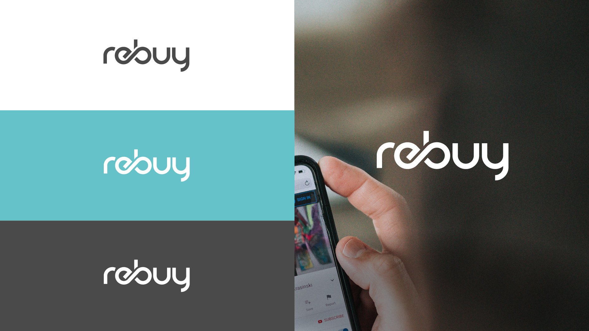
The idea of the circular economy is also reflected in the logo and all other design elements. The circle is the basic shape of all letters, complemented by the infinity symbol. It stands for the principle resell - rebuy - repeat.

The new claim
"Gebraucht, wie nie zuvor" in German means botH "USED like never before" And "needed like never before".

The not new manifesto

None of this is new.
Almost all of us know what it says here: That we can't go on like this. That we have to protect the environment. That we consume more resources than grow back. That there are mountains of electronic waste and islands of plastic. That a society called a throwaway society is also throwing away its future. From here on, it gets a little newer: there is another way. We can use existing resources by giving used products a new life. That's what we've been doing at rebuy since 2004. Since then, you can sell and buy cheap and at the same time high-quality used electronics and media from us. Our customers call it ingenious. We call it: circular economy. That's not a new idea either, but it's a very good one. The NEWEST and greatest thing is that this idea is gaining new friends every day. New supporters, new advocates, new fans - and even imitators. But that is also good! Because who, if not us, would know better that not everything always has to be new. This thinking is needed like never before. rebuyClient: rebuy
Design: Heidrun Kleingries


